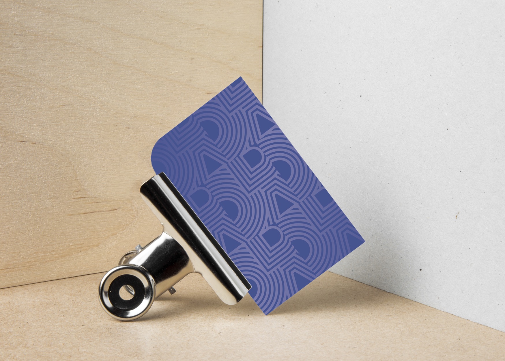
ODA
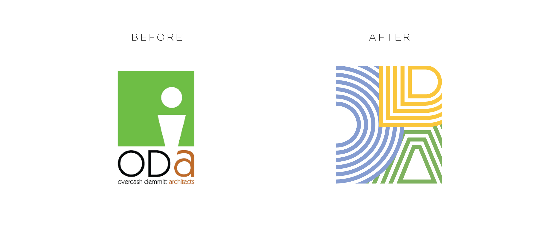
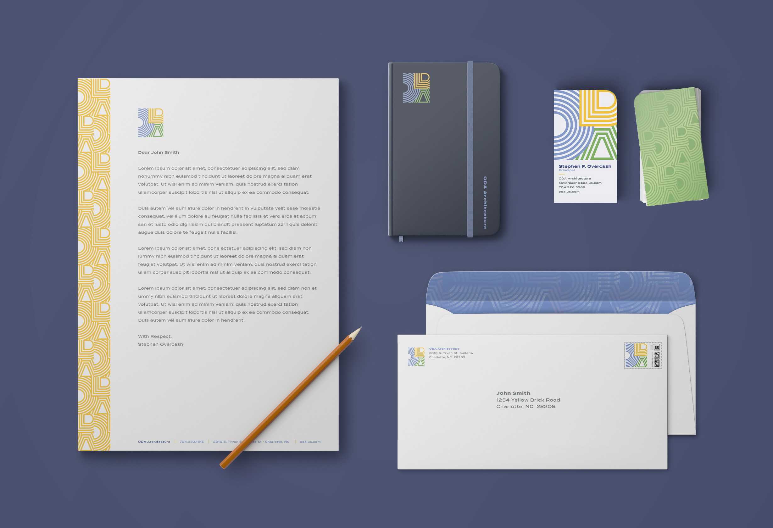
Overcash Demmitt Architects came to us wanting to transition to a new, shorter name: ODA. They tasked us with creating a new identity that reflected their soul: creating fun experiences through memorable architectural design. They want their clients to feel comfortable being uncomfortable.
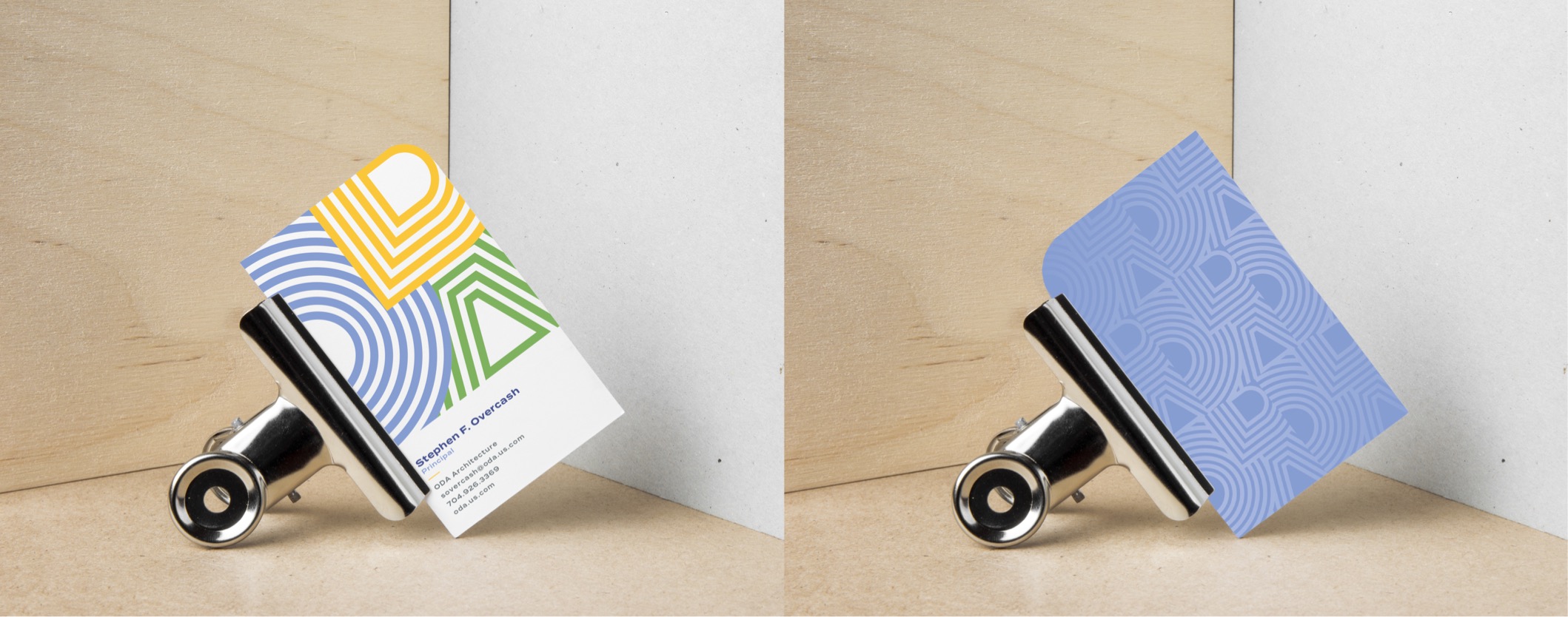
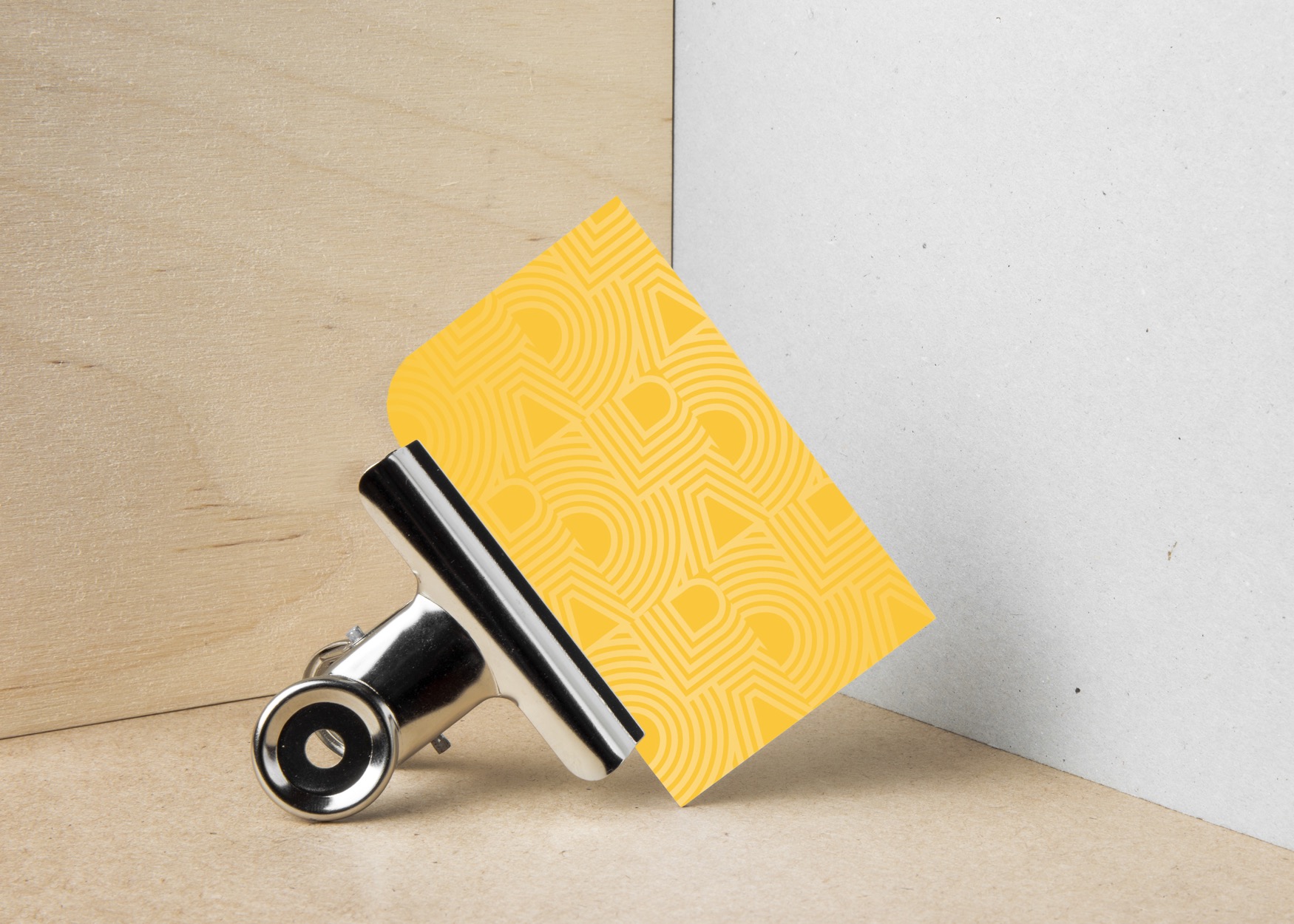
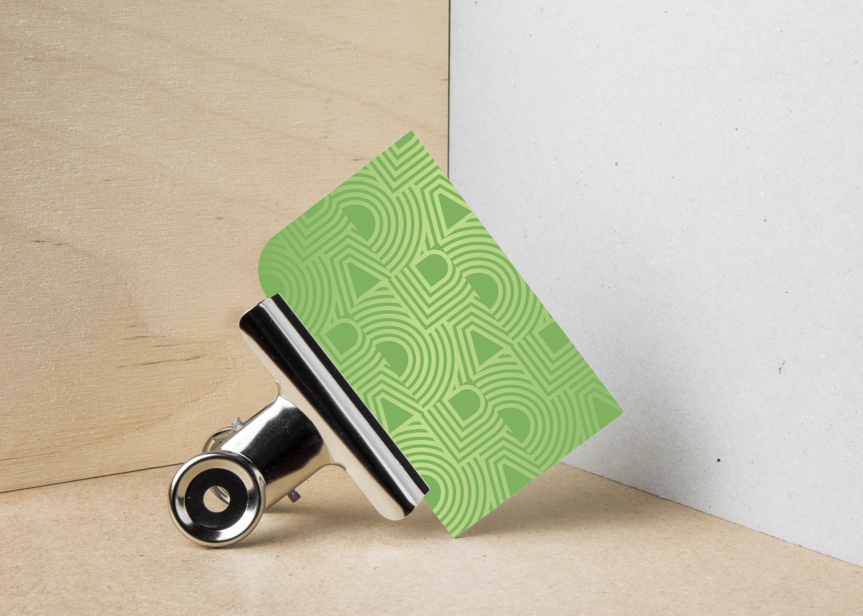
We kept this in mind as we created their logo and nontraditional color palette. In the end, we created a brand system for ODA that is modern, memorable and pretty damn cool.
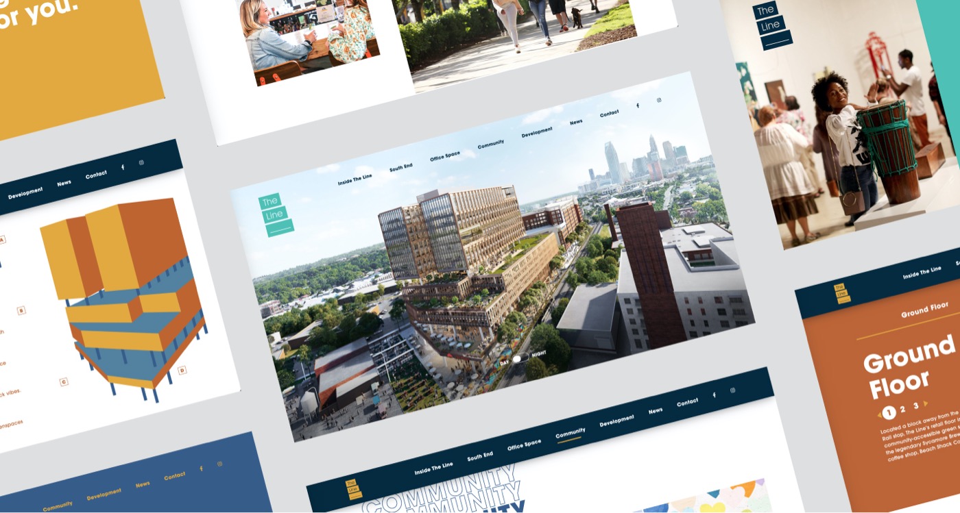
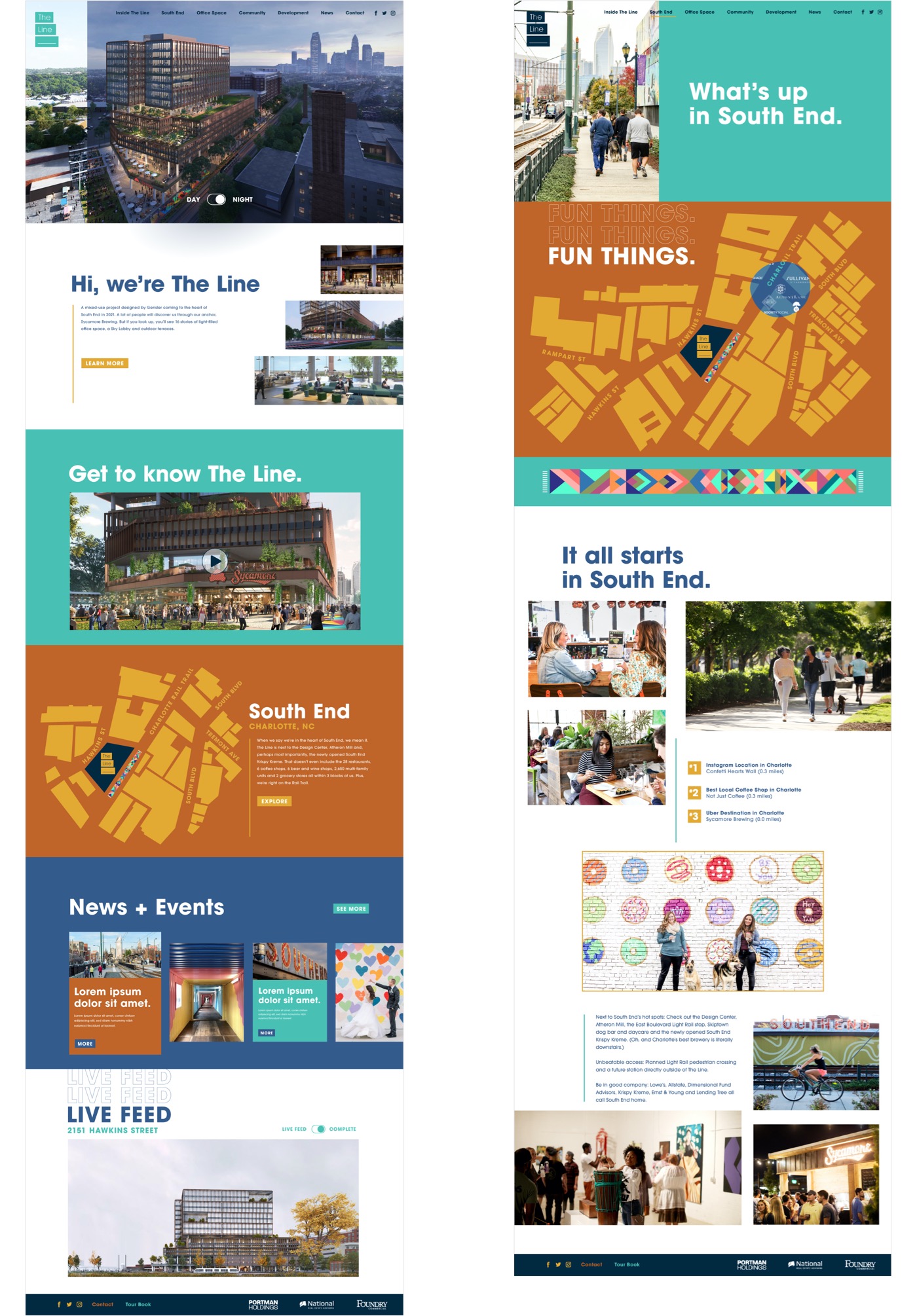
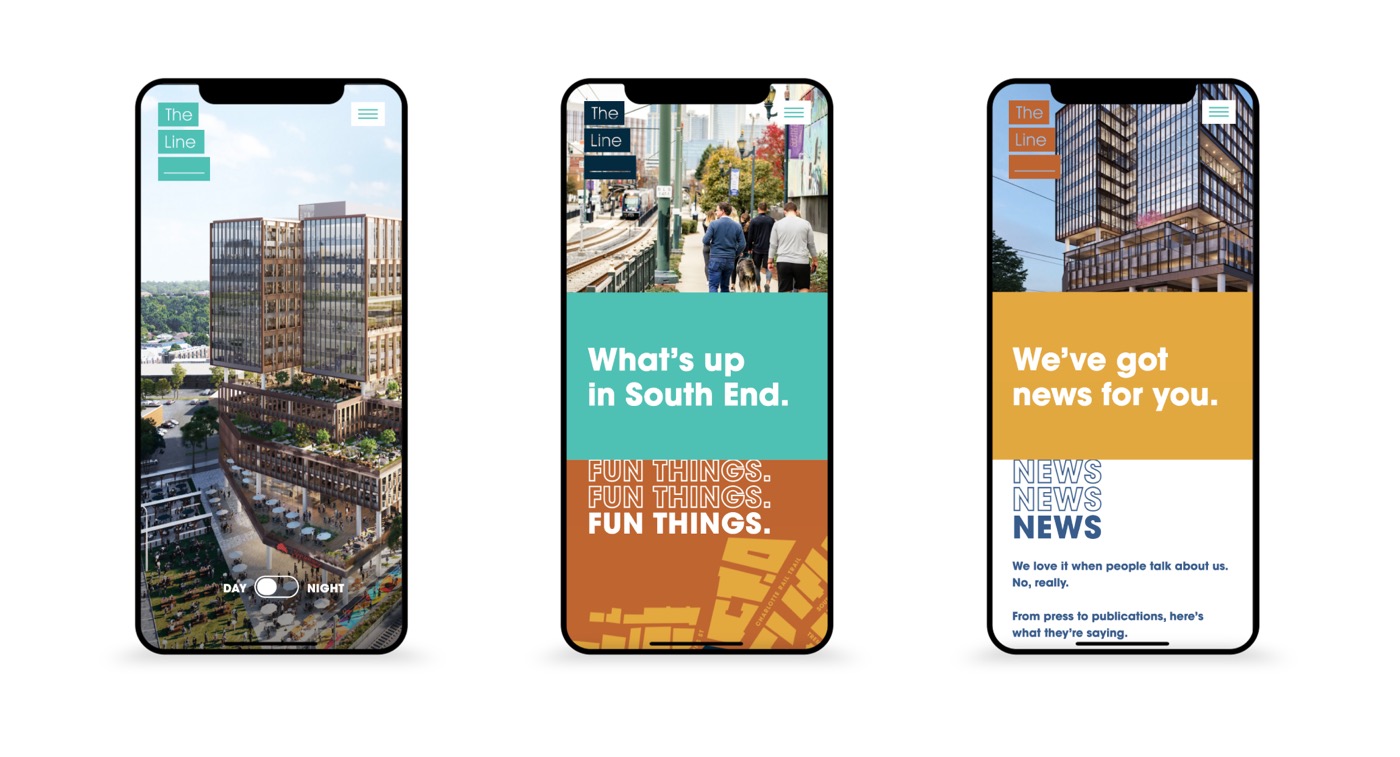
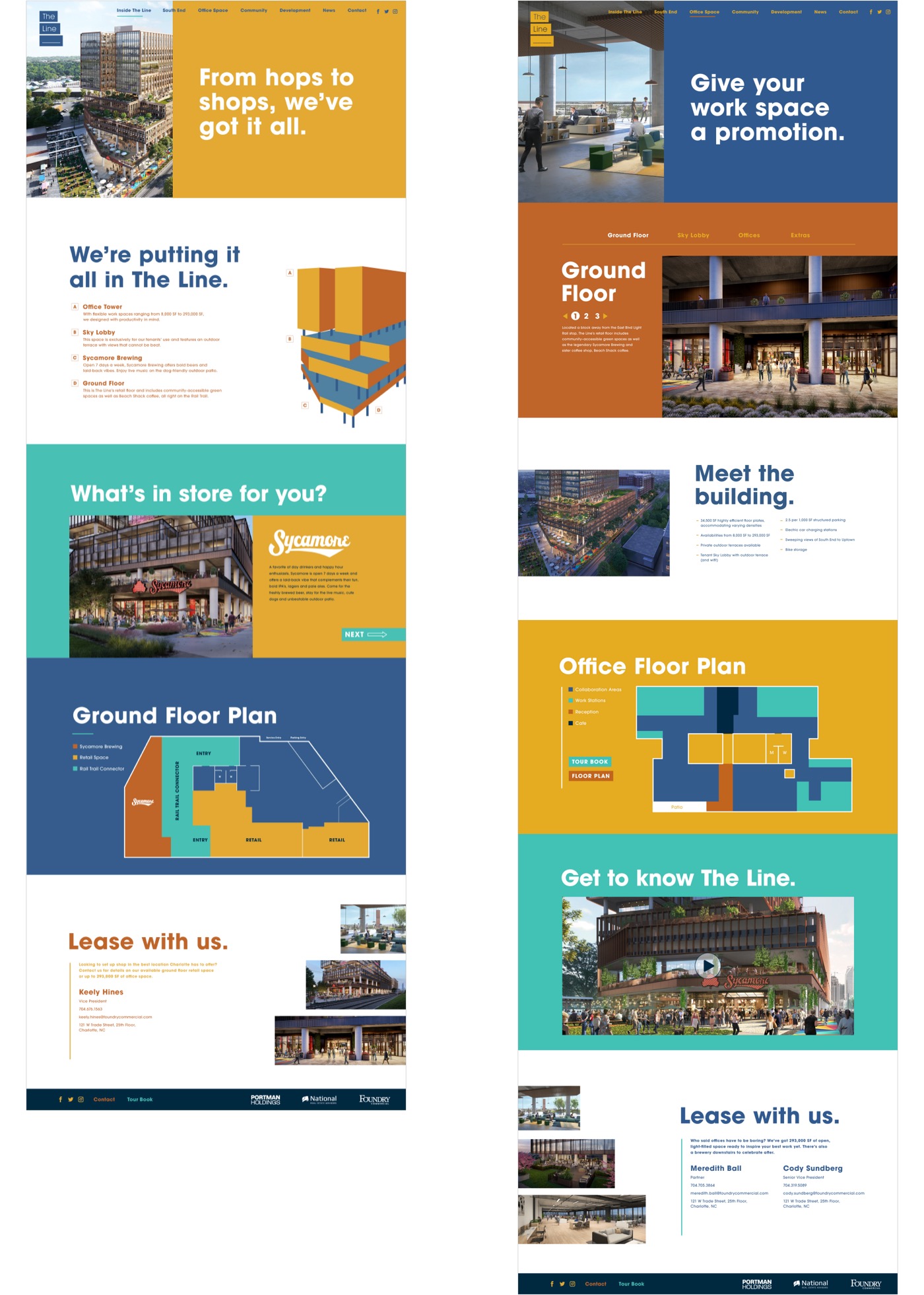
We incorporated The Line’s playful brand personality throughout the site with interactive features such as a homepage day/night toggle (we prefer night), a custom South End hover map and construction time-lapse.
